The preceding two chapters discussed consumption; this chapter discusses production. For simplicity we assume that there is only a single input to production, the producer's time, which may be used to produce any one of a variety of goods. You may think of these goods either as services, such as lawn mowing or dish washing, or as objects produced from raw materials that are freely available. Alternatively, you may want to think of the producer as actually an employee who produces some form of labor (assembling automobiles, painting houses) and sells it to a firm that combines labor with other inputs to produce goods.
Implicit in the assumption of a single input and a single output is the further assumption that the producer is indifferent between an hour spent mowing lawns and an hour spent washing dishes. Otherwise there would have to be either an additional input (unpleasantness of mowing lawns) or an additional (perhaps disvalued) output (getting grass all over my clothes), which would violate our assumption of only one input and one output.
In Chapter 9, we will analyze more complicated forms of production. Each production unit (a firm rather than a single worker) will have a production function, showing how it can combine inputs, such as labor and raw materials, to produce different quantities of output. The production decision will then involve several steps. The firm must first find, for any quantity of output, the lowest cost way (combination of inputs) to produce it; once it has done so, it will know the cost of producing any quantity (its total cost function). Given that information and the market price, the firm decides how much to produce in order to maximize its profit.
In Chapters 3 and 4, we derived the demand curve for a good from the preferences of the consumer; in this chapter, we will be deriving supply curves from the preferences and abilities of the producers. The first step is to see how a potential producer decides which good to produce. The next is to see how he decides how many hours to work. The final step is to consider the situation in which there are many different producers, so that the supply curve is the sum of their individual supply curves.
Table 5-1 shows the output per hour, the price, and the implicit wage for each of three goods--mowed lawns, washed dishes, and meals. The price for a mowed lawn is $10 and the producer can mow 1 lawn per hour, so the implicit wage is $10/hour. Similarly, washing 70 dishes per hour at $0.10/dish yields a wage of $7/hour, and cooking 2 meals per hour at $3/meal yields $6/hour. Since the only difference among the alternatives (from the standpoint of the producer) is the implicit wage, he chooses to mow lawns. Note that this decision depends on (among other things) the price. If the price for mowing a lawn were less than $7 (and the other prices were as shown in the table), he would wash dishes instead.
|
|
|
|
|
|
Output |
|
|
|
|
Price |
|
|
|
|
Wage |
|
|
|
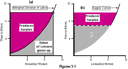
Figure 5-1a shows a graph of the marginal disvalue of labor as a function of the number of hours worked. If you were enjoying 24 hours per day of leisure (doing no work at all), it would take only a small payment ($0.50 in the figure) to make you willing to work for a single hour; you would be indifferent between zero hours a day of work and 1 hour of work plus $0.50. If, on the other hand, you were already working 10 hours a day, it would take a little over $10 to make you willing to work an additional hour.
Suppose the wage is $10/hour and you are working 5 hours per day. You would be willing to work an additional hour for an additional payment of about $3; since you can actually get $10 for it, you are obviously better off working the extra hour. The same argument applies as long as the marginal disvalue of labor to you is less than the wage, so you end up working that number of hours for which the two are equal. The number of hours of labor you supply at a wage of $10 is the number at which your marginal disvalue for labor is equal to $10. The same relation applies at any other wage, so your marginal disvalue for labor curve is also your supply curve for labor, just as, in Chapter 4, your marginal value curve for a good was also your demand curve.
Presumably leisure, like other goods, is worth less to you the more of it you have--it has declining marginal value. The cost to you of an hour of labor is giving up an hour of leisure--the less leisure you have, the greater that cost. So if leisure has decreasing marginal value, labor has increasing marginal disvalue. That fits my experience, and probably yours; the more hours a day I am working, the less willing I am to work an additional hour. Since the marginal disvalue of labor curve is increasing, the supply curve, showing how many hours you choose to work as a function of the wage you receive, is upward sloping as well. The more you are paid for each hour of labor, the more hours you choose to work.
We can now define producer surplus in a way analogous to consumer surplus. Suppose the wage is $10/hour. You are willing to work the first hour for $0.50; since you actually receive $10 for it, your net gain is $9.50. The next hour is worth about a dollar to you; you receive $10 for a gain of $9. Summing these gains over all the hours you work gives us the colored area of Figure 5-1a.
Note that the benefit to you of being able to work for $10/hour--your producer surplus--is not the same as the salary you get. Working 10 hours at a wage of $10/hour gives you a salary of $100/day. This is not, however, your gain from working. To find that, you must subtract out the cost to you of working--the value to you of the time that you spend working instead of doing something else. Your salary is the area of a rectangle ten hours/day wide by ten dollars/hour high--the sum of the shaded and the colored regions on Figure 5-1a. The value to you of your time--the total disvalue to you of working 10 hours a day--is the shaded area under the supply curve; you might think of it as how much worse off you would be if you were forced to work 10 hours per day and paid nothing. The rectangle minus the area under the supply curve is the area above the supply curve--your producer surplus, the amount by which you are better off working at $10/hour than not working at all.
The result, as you can see, is very much like the result for consumer surplus in the previous chapter. The consumer buys goods; their total value to him is measured by the area under his marginal value curve. He pays for them an amount equal to the rectangle price times quantity. His consumer surplus is the difference between the value of what he gets and what he pays--the area under the marginal value curve and above the price. The producer sells his leisure; its value to him is measured by the area under his marginal value for leisure curve, which is the same as his marginal disvalue for labor curve. He receives in exchange the rectangle wage times number of hours worked--the price for selling his leisure (working) times the amount of leisure sold (number of hours worked). His producer surplus is the difference between what he gets for his work and what it cost him--the value of the leisure he gives up--which is the area below the wage and above the marginal disvalue of labor curve. The marginal disvalue for labor curve is the supply curve for labor just as the marginal value for apples curve is the demand curve for apples.
Producer surplus, the marginal disvalue for
labor, and the supply curve for lawn mowing. The area above the marginal disvalue for labor curve and
below $10/hour is the producer surplus from being able to work at
$10/hour. The colored area above the supply curve for lawns and below
the price is the producer surplus from mowing lawns at that price
($10/lawn). The supply curve is horizontal at the price at which you
are indifferent between lawn mosing and your next most profitable
production opportunity (dish washing).
We now have the supply curve for labor, but what we want is the supply curve for mowed lawns. Since I can mow 1 lawn per hour, a price of $10/lawn corresponds to a wage of $10/hour and a labor supply of 10 hours per day corresponds to mowing that many lawns. It appears that the supply curve for lawns and for labor are the same; all I have to do is relabel the vertical axis "price in $/lawn" and the horizontal axis "lawns/day."
Appearances are deceiving; the supply curve for lawns is not the same as for labor. My decision to mow lawns instead of spending my time producing something else depended on the price I could get for doing so. If that price drops below $7/lawn, my output of mowed lawns drops to zero; I am better off washing dishes instead. The resulting supply curve is shown on Figure 5-1b. The colored area is my producer surplus from producing mowed lawns at $10/lawn. To see why my producer surplus does not include the shaded area below the line at $7/lawn, consider what my producer surplus would be if I could get $7 for each lawn I mowed. How much better off am I being able to mow lawns at $7 than not mowing lawns? I am not better off at all; at that wage, I can do just as well washing dishes.
This is another example of the idea of opportunity cost, discussed in Chapter 3. The cost to me of mowing lawns is whatever I must give up in order to do so. If the best alternative use of my time is leisure, as it is for the solid part of curve S on Figure 5-1b, then the cost is the value of my leisure. If the best alternative use is washing dishes, as it is on the dashed part of S, then the cost is the money I would have gotten by washing dishes.
Going from the supply curve for labor to the supply curve for mowed lawns was particularly simple because the rate at which I mow is 1 lawn per hour. Suppose the grass stops growing, someone invents an automatic dishwasher, and I become a cook. Figure 5-2 shows my supply curve for meals, given that my supply curve for labor is as shown on Figure 5-1a.
To derive Figure 5-2, we note that each hour of work produces 2 meals (Table 5-1). Hence I earn $10/hour cooking if the price for meals is $5/meal. Working 10 hours/day, which is what I do if I get $10/hour, produces 20 meals/day. So point B on Figure 5-1a ($10/hour and 10 hours/day) corresponds to point b on Figure 5-2 ($5/meal and 20 meals/day); similarly point A corresponds to point a. The supply curve for meals is the same as the supply curve for labor except that it is "squished" vertically (by a factor of 2) and "stretched" horizontally (by a factor of 2). Unlike the supply curve for mowed lawns shown on Figure 5-1b, it has no horizontal segment--because, by assumption, meals are the only thing left to produce.
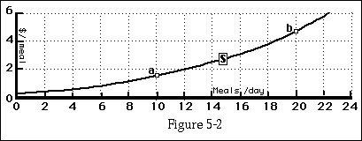
The supply curve for cooking
meals. This supply curve is the same as
the supply curve for labor, except that each hour worked corresponds
to two meals cooked and each dolar per meal corresponds to $2/hour.
Points a and b correspond to points A and B on Figure 5-1a.
So far, I have considered the supply curve of a single producer. If we have more than one, there is no reason to assume they will all be equally good at producing the different goods, nor that they will all have the same supply curves for labor. If they do not, then their supply curves for mowed lawns--or other goods--will also be different, with the horizontal sections occurring at different prices according to their relative skills at different kinds of production. A producer who is very good at mowing lawns (many mowed per hour) or very bad at doing anything else will choose to mow lawns even if the price is low. A producer who is bad at mowing lawns (many hours per lawn) or good at something else will mow lawns only when the price is high. Figure 5-3 shows the supply curves for two such producers, A(nne) and B(ill), and their combined supply curve.
At prices below $2.50/lawn, neither Anne nor Bill produces. At prices above $2.50/lawn but below $5/lawn, only Anne produces; the combined supply curve is the same as her supply curve. At a price of $5, Bill abruptly enters the market, mowing 6 lawns per day; adding that to Anne's output of 9 gives a total output of 15. When the price goes from $5 to $6, Anne increases her output by another unit and so does Bill; so total output goes up by 2 to 17.
The combined supply curve is a horizontal sum. The summation is horizontal because we are summing quantities (shown on the horizontal axis) at each price. Both A and B can sell their products at the same price; whatever that price is, total quantity supplied is the (horizontal) sum of what they each produce. The same would be true if we were deriving a total demand curve from two or more individual demand curves. All consumers in a market face the same price, so total quantity demanded at a price is the quantity consumer A demands plus the quantity consumer B demands plus . . . .
The sum of the producer surplus that B receives at a price of $6 plus the producer surplus that A receives is equal to the producer surplus calculated from the combined supply curve--the area above their combined supply curve and below the horizontal line at $6. The reason is shown on Figures 5-3a through 5-3c. Consider the narrow horizontal rectangle R shown in Figure 5-3a. Its height is [[Delta]] P, its width is QA+B = qA +qB ; so its area is [[Delta]] P x (QA+B ) = ([[Delta]] P x qA) + ([[Delta]] P x qB) = RA + RB on Figures 5-3b and 5-3c. The same applies to all of the other little horizontal rectangles that make up the producer surplus; in each case, the area of the rectangle on Figure 5-3a, showing the summed supply curve, is the sum of the areas of the rectangles on Figures 5-3b and 5-3c, which show the individual supply curves. So the shaded area on Figure 5-3a equals the sum of the shaded areas on 5-3b and 5-3c. The shaded areas are not precisely equal to the corresponding surpluses, since the rectangles slightly overlap the supply curve; but the thinner the rectangles are, the smaller the discrepancy. In the limit as the height of the rectangles ([[Delta]] P) goes to 0, the shaded areas become exactly equal to the corresponding producer surpluses; so the producer surplus calculated from the summed supply curve is the sum of the producer surpluses from the individual supply curves.
The result applies to any number of producers, as does a similar result for the consumer surplus of any number of consumers. So we can find the sum of the surpluses received by consumers or producers by calculating the surplus for their combined demand or supply curve just as if it were the demand or supply curve for a single individual. This fact will be important in Chapter 7, where we analyze the cost that taxes impose on producers and consumers, and elsewhere.
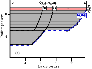
The producer surplus for a two producer supply
curve. The colored rectangle R is the sum
of RA and
RB, and
similarly for the other rectangles. So the shaded area on Figure 5-3a
is the sum of the shaded areas on Figures 5-3b and 5-3c. As![]() P approaches zero, the shaded area
on each figure becomes exactly (instead of approximately) equal to
the corresponding producer surplus. Hence the producer surplus
calculated from the summed supply curve SA+B is the sum of the producer
surplus calculated from SA and SB.
P approaches zero, the shaded area
on each figure becomes exactly (instead of approximately) equal to
the corresponding producer surplus. Hence the producer surplus
calculated from the summed supply curve SA+B is the sum of the producer
surplus calculated from SA and SB.
We now have two different reasons to expect that supply curves will slope up. The first is the increasing marginal disvalue of labor. The second is that as the price of a good rises, more and more people find that they are better off producing that good than producing anything else. As each new producer comes in, the supply curve gets a new horizontal segment--the increased price results in increased quantity above and beyond any increased production by existing producers. This will prove important in the next section, where we see that the first reason for expecting supply curves to slope up is less powerful than it at first appears.
Look again at Figure 5-1a, and think about what it means. At a wage of $1/hour, the producer is working 2 hours per day and earning $2/day. It may be possible to live on an income of $730/year, but it is not easy. At a wage of $15/hour, the same individual chooses to work 12 hours per day and earn $65,700/year. There are probably people earning that kind of money who work those hours for 365 days per year, but I suspect that for most of them the reason is more that they like working than that they want the money.
The mistake in the analysis that produced Figure 5-1a is the omission of what was described in Chapter 3 as the income effect. An increase in wages (say, from $10/hour to $11/hour) has two effects. It makes leisure more costly--each hour not worked means $11 less income instead of $10. That is an argument for working more hours at the higher salary. But at the same time, the increased wage means that the producer is wealthier--and is therefore inclined to consume more leisure. It is possible for the second effect to outweigh the first, in which case the increased wage causes a decrease in hours worked, as shown in Figure 5-4. This is called a backward-bending supply curve for labor; the backward-bending portion is from F to G (and presumably above G). The result, in the case of a single producer, would be a supply curve for goods that sloped in the wrong direction; for some range of goods, higher prices would generate less output instead of more.
This is not the first time we have seen a conflict between income and substitution effects. In Chapter 3, the same situation generated a Giffen good--a good whose demand curve sloped in the wrong direction. I argued that there were good reasons not to expect to observe Giffen goods in real life. Those reasons do not apply to the backward-bending supply curve for labor.
One of the reasons was that while we expect consumption of most goods to go up when income goes up, a Giffen good must be a good whose consumption goes down with increasing income--an inferior good. Indeed, it must be so strongly inferior that the income effect of an increase in its price (which, since we are buying it, is equivalent to a decrease in real income) outweighs the substitution effect. Our labor is something we are selling, not buying; an increase in its price (the wage rate) makes us richer not poorer, and so inclined to buy more leisure. So the backward-bending supply curve for labor only requires leisure to be a normal good.
The other reason a Giffen good is unlikely is that it must be a good on which we spend a large fraction of our income, in order that the decrease in its price can have a substantial effect on real income. This is implausible in the case of consumption, but not in the case of production. Most of us diversify in consumption but specialize in production; we divide our income among many consumption goods, but we get most of that income from selling one kind of labor. If the price we get for what we sell changes substantially, the result is a substantial change in our income. Hence the backward-bending supply curve for labor is far more likely to occur than is the Giffen good.
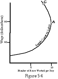
A backward-bending supply curve for
labor. As the wage increases, the number
of hours worked first increases (up to point F), then decreases.
Economics is considerably simpler if demand curves always slope down and supply curves always slope up than if they insist on wriggling about as in Figure 5-4. Fortunately the argument for upward-sloping supply curves for goods does not entirely depend on upward-sloping supply curves for labor. If individuals supply less labor, and so mow fewer lawns, as the price of lawn mowing rises, their individual supply curves will slope backward. But if an increase in the price increases the number of people who find that lawn mowing yields a higher wage than any other alternative, the aggregate supply curve for lawns may still slope normally. It is particularly likely to do so in a large and complicated society. If many different goods are being produced, with the production of each employing only a small part of the population, even a small rise in the price of a good can induce some people to switch to producing it. It is still more likely if, as seems likely, only some of the producers are on the backward-bending portion of their supply curve for labor.
Another way of looking at the problem of the backward-bending supply curve for labor is as a result of the effect of a change in income on the relation between marginal value and marginal utility. When your wage increases from $10/hour to $11, you are being offered more dollars for your time than before, but since at the higher income each dollar is worth less to you (the marginal utility of income has fallen), you may actually be being offered less utility--$11 at your new, higher income may be worth less to you than $10 was before. If so, and if the marginal utility of leisure to you has not been changed by the increase in your income, you will choose to sell less of your time at the higher wage, and so work fewer hours. If the marginal utility of leisure has increased (you now have more money to spend on golf games and Caribbean vacations), the argument holds still more strongly.
The analysis of production given in the first part of this chapter (ignoring income effects) would correctly describe a producer whose income from other sources was large in comparison to his income from production. Changes in his wage would have only a small effect on his income, so we could legitimately ignore the income effect and consider only the substitution effect. The result would be the sort of curves shown in Figures 5-1a, 5-1b, and 5-2. It would also correctly describe a producer facing only a temporary change in his wage. He can transfer money from one year to another by saving or borrowing, so the value of money to him depends not on his current income but on some sort of lifetime average--his permanent income. His permanent income is changed only very slightly by changes in this week's wage, so the income effect of a temporary wage change is small.
The question of whether the supply curve for labor was or was not backward bending was a matter of considerable controversy 200 years ago, when Adam Smith wrote The Wealth of Nations, the book that founded modern economics. Some employers argued that if wages rose their employees would work fewer hours and the national income would fall; Smith argued that higher wages would mean better fed, healthier employees willing and able to work more in exchange for the higher reward. It is worth noting that Smith, who is usually described as a defender of capitalism, consistently argued that what was good for the workers was good for England and almost as consistently that what was good for the merchants and manufacturers (high tariffs and other special favors from government) was bad for England. He was a defender of capitalism--but not of capitalists.
So far, we have analyzed the supply curve for labor, or for goods or services produced by labor, by using marginal value curves. Another way is by using indifference curves. The indifference curves on Figure 5-5 show an individual's preferences between leisure (defined, at this point, as any use of your time that does not bring in money) and income. Using such a diagram, we can derive a supply curve for labor in a way that allows for the possibility that it may be backward bending. Figure 5-5a shows the production possibility sets (possible combinations of leisure and income) corresponding to wages of $5, $10, and $15/hour, along with the corresponding indifference curves and optimal bundles, for an individual with no other source of income. In each case, one possibility is 24 hours per day of leisure and no income. Another is no leisure and a daily income of 24 times the hourly wage. With a wage of $5/hour, for example, the line runs from 24 hours of leisure and no income to no leisure and an income of $120/day. The available combinations of leisure and income on Figure 5-5a correspond to points on the line between those two extremes. As the wage moves from $5 to $10 to $15/hour, the line moves from W1 to W2 to W3 and the optimal bundle from A1 to A2 to A3 .
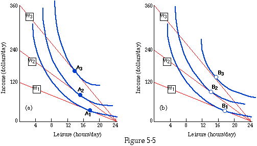
Indifference curve/budget line diagrams for
calculating the supply curve of labor. The
budget lines show the alternative bundles of leisure and income
available to a worker at different wage levels; the indifference
curves show his preferences among such bundles. The indifference
curves of Figure 5-5a lead to a normaly sloped supply curve for
labor; those of Figure 5-5b lead to a backward-bending supply curve
for labor.
The indifference curves illustrated in Figure 5-5a imply a normal supply curve for labor, at least over the range of wages illustrated; as the wage rises, so does the number of hours worked (shown by a fall in the number of hours of leisure). Figure 5-5b illustrates a different set of indifference curves, leading to a backward-sloped supply curve. Figure 5-6 shows the two supply curves, S1 (obtained from Figure 5-5a) and S2 (from Figure 5-5b).
Students who try to redo the calculations shown on Figures 5-5a, 5-5b, and 5-6 in homework (or exam) problems frequently make the mistake of assuming that they can simply connect points such as A1 , A2 , and A3 with a line, and then redraw the same line on another graph as the supply curve for labor. But the vertical axis of Figures 5-5a and 5-5b is income, while the vertical axis of Figure 5-6 is the wage rate; income is wage (dollars/hour) times number of hours worked. The wage on Figure 5-5a is not the height of a point but the slope of a line. W1, for example, has a slope of (minus) $5/hour and shows the alternatives available to someone who can work at that wage. The point on Figure 5-6 that corresponds to A1 on Figure 5-5a is C1; its vertical coordinate is $5/hour (corresponding to the slope of W1) and its horizontal coordinate is 7 hours per day (corresponding to the number of hours worked at A1--24 hours per day total minus 17 hours per day of leisure). You may want to check for yourself the correspondence between A2 and C2 and between A3 and C3.
You may have realized by this point that what we are analyzing in this chapter is simply a special case of what we already analyzed in Chapters 3 and 4. Instead of talking about a supply of labor and a marginal disvalue for labor, we could have started with an individual who had an endowment of a good called leisure (24 hours per day), which he could sell at a price (his wage) and for which he had a marginal value curve. Just as in Chapter 4, the marginal value curve is identical to the demand curve. The marginal value for leisure curve is the same as the marginal disvalue for labor curve, and the demand curve for leisure is the same as the supply curve for labor, except that in each case the direction of the horizontal axis is reversed--increasing leisure corresponds to decreasing labor.
Our old friend the equimarginal principle applies here as well. The individual sells an amount of leisure (works a number of hours) such that the value of a little more leisure (the disvalue of a little more labor) is just equal to the price he is paid for it. In equilibrium, the wage equals the marginal value of leisure (marginal disvalue of labor).
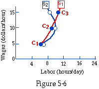
The supply curves for labor implied by Figures
5-5a and 5-5b. Points C1, C2, and C3 correspond to points
A1,
A2, and
A3 on Figure
5-5a. Note that the vertical axis of this figure shows wage, not
income; wage on Figures 5-5a and 5-5b is not the height of a point
but the slope of a line.
So far, we have considered production under relatively simple circumstances. Producers sell their output on the market, so all they have to know in order to decide what to produce is how much it sells for. Amount of production, for any good, is simply proportional to amount of time spent producing it. In this section, we will consider some more complicated cases.
So far in my discussion of production, I have assumed that the producer sells his output rather than consuming it himself. Figure 5-7 shows one way of analyzing the alternative--a situation where you consume your own output. MV is the marginal value to you of mowed lawns; MdV is the marginal disvalue of your labor. Your rate of output is 1 lawn per hour. The horizontal axis shows how many mowed lawns you produce and consume. You consume a mowed lawn by enjoying the view--I am not assuming that you eat grass.
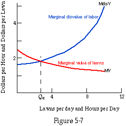
Marginal value/marginal cost diagram for a
producer who consumes his output himself. On Figure 5-7, the marginal cost of production is the
marginal disvalue of labor; since the output rate is one lawn per
hour, the vertical axis can be read as either dollars per hour or
dollars per lawn, and the horizontal axis can be read as either lawns
per day or hours per day.
If the quantity is less than Qe , where the two curves cross, then the marginal value of the good is greater than the marginal disvalue of the labor used to produce it. That means that if you produced an additional unit, the value to you of the good would be more than the cost to you of the labor used to produce it, so you would be better off producing it. That remains true as long as quantity is less than Qe, so you keep increasing your level of output (and consumption) until it reaches Qe. Beyond that, additional units cost you more labor than they are worth, so any further increase in output would make you worse off.
Figure 5-7 shows a situation where only one kind of good can be produced. Figure 5-8 shows a situation where two goods can be produced--meals and mowed lawns. The individual's preferences between them are shown by indifference curves, as in Chapter 3. If he chooses to work 10 hours per day, he can produce 10 lawns, or 20 meals, or any intermediate bundle; his production possibility set is the colored area on Figure 5-8. The optimal bundle is the point in the set that intersects the highest indifference curve--point A on the figure. The diagram is exactly the same as for an individual with an income of $10/day who is able to buy lawn mowing at $1/lawn and meals at $0.50/meal. In each case, the individual chooses the best bundle from a collection that includes ten lawns (and no meals), 20 meals (and no lawns), and everything in between.
If you move back from the picture, however, and think about what it means, there is one important difference between the two cases. In discussing a consumer spending money, I argued that he would always spend his entire income, since the only thing money is good for is buying goods. The equivalent in the case of time is always working 14 hours per day--or perhaps 24!
The problem is that in drawing Figure 5-8, I implicitly assumed that the only things that matter to you are meals and mowed lawns--in particular, I assumed that you have no value at all for your own leisure. If that were true, you would work 24 hours per day. In drawing the figure, I have correctly translated the assumption into geometry without pointing out, until now, that the assumption itself is absurd. That is an example of why it is a good idea to move back and forth between mathematical and verbal descriptions, in order to make sure you know what your mathematics actually stands for. It is not unusual for articles to be submitted to economics journals that, when translated into English, turn out to make no sense. Some of them get published.
What the figure can be used for is to show what combination of the two goods the individual will choose to produce if he decides to work a certain number of hours. To find out how many hours he would choose to work, we would need to add a third dimension in order to show his preferences among meals, lawns, and leisure.
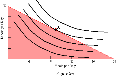
Indifference curves and production possibility
set for an individual working 10 hours per day. The individual can produce 10 lawns per day or 20 meals
per day; different points on the line between 10 lawns and 20 meals
represent different divisions of time between producing lawns and
producing meals. A is his optimal point.
Let us now drop another assumption. So far, the output of each good has been proportional to the time spent producing it. As a result, the frontier of the production possibility set for any pair of goods (total hours worked held constant, as in Figure 5-8) is a straight line, like a budget line. The similarity is not accidental. In Chapter 3, the consumer got goods by spending money; in this chapter, he gets them by spending time. In both cases, total expenditure is simply the sum of the price of one good--in money or in time--multiplied by the quantity of that good bought plus the price of the other good multiplied by the quantity of it bought.
Figure 5-9a shows a more complicated case--the production possibility set of someone who is more productive if he specializes. If he spends all his time mowing lawns, he can maintain his lawn-mowing skills at a high level and mow more lawns per hour than if he spends much of his time cooking. If he spends all his time cooking, he can maintain his culinary skills at a high level and produce far more meals per hour than if he spends most of his time mowing lawns. (Perhaps our measure of quantity of meals cooked should include some allowance for quality as well, so that a meal cooked by a professional mower of lawns is equivalent to 1/10 of a meal cooked by a Cordon Bleu chef). Point J shows what happens if he tries to divide his time between lawn mowing and cooking, making himself "a jack of all trades and a master of none."
Figure 5-9b shows a production possibility set whose boundary curves in the opposite way. You may think of this as describing someone who could engage in two quite different kinds of production--digging ditches and writing sonnets. Digging ditches uses the producer's muscles; writing sonnets uses his mind. He can compose a few more sonnets per day if his mind is not distracted by ditch digging, and he can dig a few more ditches if he is not trying to find three more words that rhyme with "world" for the octave of a Petrarchan sonnet. But the two activities compete with each other only mildly, producing the curve shown in the figure.
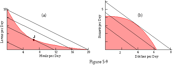
Two cases of non-linear production.
The individual is producing goods to sell.
The shaded areas are the different bundles that he can produce. The
straight lines are equi=income curves; each shows all the different
bundles that sell for a given amount of money. The producer wants to
produce the bundle that sells for the largest amount. That will be
the point in the shaded region that touches the highest equi-income
curve.
Let us now go back to the problem with which we started this chapter--which good to produce. As in the earlier discussion, we assume the individual is producing goods to sell on the market rather than for his own consumption. We can reproduce the argument of Table 5-1, in this more complicated situation, by adding to our figure equi-income lines--lines that show the different bundles of goods that can be sold for the same total amount. These are indifference curves from the standpoint of the producer, since all that matters to him about his output is what he can sell it for. Unlike our usual indifference curves, these are straight lines. If lawn mowing sells for $10/lawn and meal cooking for $5/meal then if you start with a bundle of 10 lawns and want to construct other bundles that will bring you the same amount of money ($100), you find that each time you subtract 1 lawn you must add 2 meals. The result is a straight line, as shown on Figures 5-9a and 5-9b. The slope of the line depends on the relative prices of the two goods. Picking the optimal set of goods to produce is easy. For any number of hours you consider working, find the highest line that touches the corresponding production possibility set; the point where they touch is the most valuable bundle you can produce with that amount of labor.
By looking at Figure 5-9a, you should be able to convince yourself that whatever the slope of the equi-income lines, the highest equi-income line that touches the production possibility set touches either at one end of the curve (all lawns) or at the other (all meals) or possibly at both, but never anywhere in the middle. This corresponds to what we usually observe--people specialize in production, spending all their time (aside from home production--cooking your own food and washing your own face) producing a single good or service. The situation of Figure 5-9b, on the other hand, while it can lead to specialization (if the slope of the line is either very steep or very shallow, implying that one of the goods has a very high price compared to the other), can also lead to diversified production, as in the case shown.
Figures 5-9a and 5-9b look very much like indifference curve diagrams, especially Figure 5-9a. In a way they are, but the straight line and the curve have switched roles. In an ordinary indifference curve diagram, the straight line is a budget line, showing what bundles of goods the consumer can choose among. The curve is an indifference curve, showing what bundles are equally attractive to him. On Figure 5-9, the curves are the equivalents of budget lines--they show the different bundles of goods the consumer can choose to produce. The straight line equi-income curves are indifference curves--since the goods are being produced for sale, the producer is indifferent between any two bundles that sell for the same amount.
From another standpoint, the straight line equi-income curve of Figure 5-9 and the straight budget line of Chapter 3 are the same line. Both show all bundles of goods that cost a given amount of money. From the standpoint of the consumer with a certain amount of money to spend, the line represents alternative bundles that he can buy with that amount of money. From the standpoint of the producer, it represents alternative bundles that he can sell to get that amount of money. It is the same transaction seen from opposite sides.
The logic of what we are doing here is essentially the same as in Chapter 3. An individual has objectives (utility from consumption for the consumer, utility from income and leisure for the producer) and opportunities. He chooses that one of the available opportunities that best achieves his objectives. The geometric apparatus of budget lines and indifference curves is simply one way of formalizing the definition of economics at the beginning of Chapter 1, one way of analyzing people who have objectives and tend to choose the correct way to achieve them.
1. Figure 5-10a shows your labor supply curve. Your wage is $10/hour. What is your producer surplus ? Give either a numerical or a graphical answer.
2. Figure 5-10a shows your marginal disvalue for labor curve. You can make $8/hour washing cars or $6/hour waiting on tables. What is your producer surplus from washing cars? In other words, how much worse off would you be if the carwash closed down?
3. Your rich uncle just died and left you, to your surprise, a $10,000/year trust fund. Figure 5-10a used to describe your supply curve for labor. What do you think your labor supply curve might look like now? Draw it.
4. You can produce 3 falchions/hour or 5 petards/hour. Figure 5-10b shows your supply curve for labor. Draw your supply curve for falchions, assuming that the price of a petard is $2. Draw your supply curve for petards, assuming that the price of a falchion is $4 .
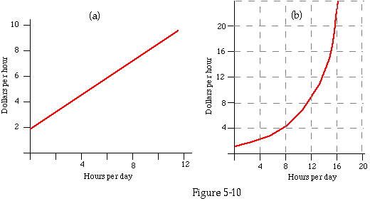
Supply curves or marginal disvalue curves for
labor. For problems 1, 2, 3, and 4.
5. Some people, such as scoutmasters and PTA officials, are willing to work at jobs that pay nothing--even, in some cases, at jobs that pay less than nothing. Draw a labor supply curve for such a person.
6. In the text, I prove that the producer surplus calculated from the summed supply curve for two producers is the sum of the producer surpluses calculated separately. Prove the same result for consumer surplus.
7. Prove the same result for three producers.
8. Prove that the result applies to any number of producers.
9. In the examples discussed, producer surplus is always less than salary. Can you think of a situation where it would be greater? Discuss.
10. "At a cost of only $10,000,000 a year of public expenditure, this administration, by attracting new firms into the state, has increased the income of our citizens by $20,000,000. The citizens should be grateful; for every dollar of tax money they give us, we are providing them $2 of income." Assume the facts are correct; discuss the conclusion in terms of the ideas of this chapter.
11. The production possibility lines on Figure 5-5 were drawn on the assumption that if you spend no hours working you have no income. Draw a budget line for someone who receives $10/day from his parents and, in addition, can work as many hours as he wishes for $5/hour.
12. What are some other situations that the budget line you drew for the previous question might describe?
13. Draw a budget line for someone who can work as many hours as he wishes for $10/hour, but must pay $20/day interest on his accumulated debts.
14. What are some other other situations that the budget line you drew for the previous question might also describe?
15. In Chapter 4, I rejected the idea that economists assume individuals value only income. Draw a set of labor/leisure indifference curve for someone who always prefers more income to less, whatever the cost in other values. How many hours a day will he work?
16. Figure 5-11 is an indifference map showing your tastes for leisure and income. Draw the corresponding supply curve for labor over a range of wages from $1-$10/hour. How does it slope? Show how you calculated it.
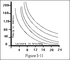
Indifference curves showing preferences with
regard to income and leisure. For Problem
16
The following problems refer to the optional section:
17. In the situation shown in Figure 5-7, how much worse off would you be if you were forbidden to produce anything? Discuss your answer in terms of producer surplus and consumer surplus.
18. Use indifference curves to explain why we usually do not specialize in consumption. Use indifference curves to show a situation where an individual does specialize in consumption. This particular kind of solution to the decision problem illustrated on an indifference curve diagram has a name; what is it?
19. Draw an indifference curve diagram showing the producer of Figure 5-9a producing goods for his own consumption. Where is his optimal point? Is he specializing or diversifying?
20. Draw an indifference curve diagram showing the
producer of Figure 5-9b producing goods for his own consumption.
Where is his optimal point? Is he specializing or diversifying?